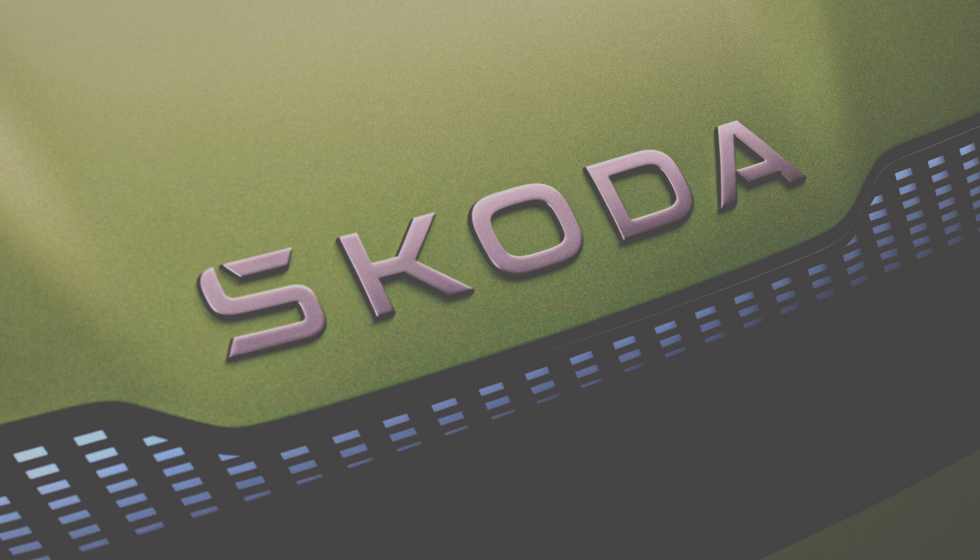
According to Škoda, the new NEXT LEVEL ŠKODA 2030 strategy focuses production on electrification and digitalization. In accordance with the adopted course, the logo was also changed, which was adapted to these two trends: it became simpler — flat and without the famous "hook" above the S.
"The increasing use of logos in various digital formats prompted us to change the logo design to a 2D graphic. It is easier to recognize and notice than the existing three-dimensional design ," says Petra Makkeova from the companyʼs marketing department.
Also, the company will separately use the Skoda name and the traditional arrow in a ring, which will become the main communication tool. At the same time, the logo will appear not only on the back of the car, as it was in recent years, but also on the front. In the letter S, instead of the well-known "hook", Skoda received a new accent.

The new identity includes two new shades of green: emerald green and electrifying green. The company claims that the new shades preserve the history of the brand, but are more modern and hint at electric mobility.
The new logo will gradually appear in electronic advertising materials, later in car entertainment systems and dealerships. It will appear on new Skoda models as early as 2024.
Subscribe to the Telegram channel of the Auto Market Research Institute to be the first to receive information without advertising or spam.


